An awesome website has to do more than just look pretty. It also has to have more going for it than great content or savvy website marketing. Many beautifully designed websites tank on the Internet because they simply aren’t user friendly. For your new website design to truly be successful, it has to be easy to use. If visitors go to your site and see a gorgeous layout but can’t figure out how to get to the next page of information or they can’t quickly search and find what they’re looking for, they’ll leave. Don’t let your website design be the one they’re referring to when they say, “The website design looked great, but getting around the site was torture.”
Keeping Your Website Design Focused
If you’re doing plenty of website marketing but still aren’t seeing many repeat customers to your site, take another look at the design. Don’t try to be too many things at once. Don’t try to be everything to everybody. And do NOT cram all the information about your product or service onto one page. Internet users tend to scan rather than read, and too many details can drive potential customers away. People want to be able to learn something by glancing at your website design rather than scrolling through endless text.
Use short, concise descriptions and plenty of headings and subheadings to break up the information into easily digested bytes of information. You don’t have to go into a great deal of detail on your home page; you can provide more information on other pages. Simply leave a nice little trail of bread crumbs that lead from the initial page to additional pages and make sure those bread crumbs are easy to find.
Never Skip The Search Box
You may think you know what site visitors are looking for in your website design, but there’s always room for surprises. Be sure you include a prominently placed search box on most, if not all, of your pages. Some people won’t even bother to check out your navigation tabs; they’ll go straight for the search box and type in a word or phrase in order to go directly to the page or pages that have the information they are seeking.
Use A Logical Website Design
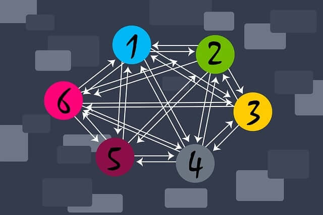
The flow of information on your site should be intuitive. Don’t show a navigation bar that takes you to some other pages while neglecting others. If you have a full page for one product, have complete pages for other products, otherwise visitors may become frustrated or confused when they can’t find the specific product page they’re looking for. Cross linking your pages is best for website design, but only if you’re willing to link all of your pages to the various other pages that make sense. If you don’t cross link, visitors will have to return to the home page each time they want to navigate to a new page; this can grow old quickly, so spending some time to cross link will have definite benefits. Your website marketing will benefit as well; you’ll have additional pages to link to from outside sources.
When you use tabs in your website design, don’t get too creative or use too many words. Remember, people should be able to glance at the tabs and immediately know what each additional page is about. Using common phrases such as “About Us” and “FAQs” are reassuring and easy to understand.
Include A Sitemap In Your Web Design
Even the best website design may leave some visitors confused, so be sure and include a site map that is accessible. In some cases, it may be the easiest way for an individual to navigate your website design. It will also give visitors a “bird’s eye view” of your website and may encourage them to visit other pages they hadn’t thought about.
If your website design features intuitive links from page to page as well as an easy to navigate plan, your website marketing will be more successful and you should see an increase in customer satisfaction and response.


